Case Study
Rydo × AIIMS
Rydo hero 1
Rydo hero 2
Rydo hero 3
Rydo hero 4
Rydo hero 5
AIIMS Group — Client Feature

The ride to the top.

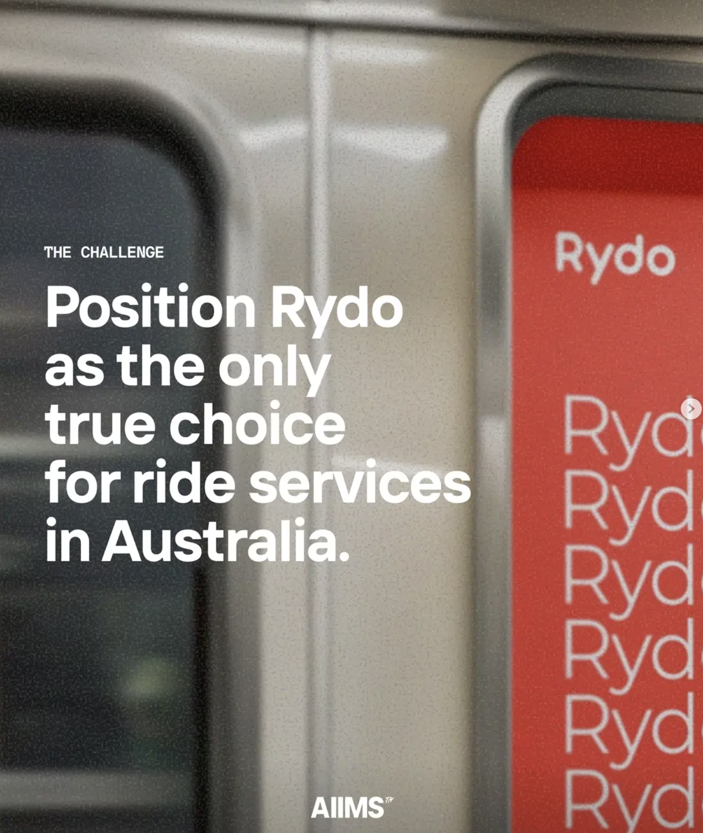
How AIIMS positioned Rydo as Australia’s premium hybrid rideshare and taxi platform — challenging Uber on every front.

Scroll
Branding  •  Web Design & Dev  •  SEO  •  SEM  •  Social Media  •  Graphic Design  •  Production  •  GMB
Transport & Rideshare HALO Marketing Full Creative Suite
The Brief

Australia had Uber. Then came Rydo.

The Australian ride-hailing market is a $2.35 billion industry in 2026, dominated at the surface by global giants. Uber holds roughly 68% of market share. DiDi chips away at another 18%. For any challenger brand to cut through in this space, it takes more than a good app. It takes a full creative conviction about who you are and why you’re better. Rydo is a homegrown Australian taxi and hire car booking app that does something Uber simply cannot: it combines the structure and reliability of the regulated taxi industry with the convenience and modernity of a rideshare platform. Cash payments. Air conditioning guaranteed. Chargers on board. Wheelchair accessible vehicles. Maxi cabs. Things you never quite get with the alternatives. The mission AIIMS was handed was unambiguous: position Rydo as the only true choice for ride services in Australia. Not just a decent local option. The definitive one.
Market Context
The NSW Taxi Council formally partnered with Rydo Technologies to back app-based booking as the future of the taxi industry. With 15,000+ taxis connected to the platform and a growing corporate travel segment forecast to grow at 4.65% CAGR through 2031, Rydo’s timing was right. What it needed was a brand that matched the ambition.
Rydo campaign visual
Rydo Campaign — Brand Identity Shoot
Rydo brand visual full width
15k+
Taxis connected to the Rydo network
3
Major cities: Sydney, Melbourne, Brisbane
$2.35B
Australian taxi market size in 2026
8
Service lines across the HALO strategy

“No one’s ever been this in-depth… I actually understand it — the complicated stuff.”

Leila Diab  /  Marketing Manager, Rydo
Rydo brand design

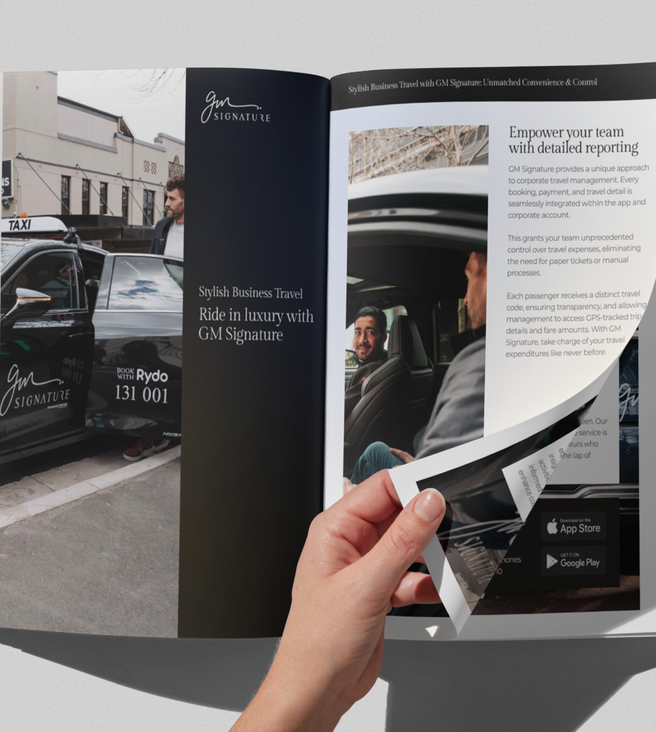
Visual Identity System — Brand Refresh

Design Vision

Room to breathe. Room to lead.

The rebrand started with a single decision: remove the logo from its circular enclosure. It sounds simple. The reasoning was precise. A logo locked in a circle carries weight. It’s contained. The Rydo brand needed to expand across billboards, taxi decals, social content, and app interfaces. It needed to breathe. The resulting visual identity blends luxury real photography with modern vector elements, using bold orange as the visual anchor. This balance between premium sophistication and urban vibrancy was not accidental. Rydo needed to appeal to a broad demographic while retaining a polished, aspirational feel. The goal was brand recall at speed. A person seeing a Rydo-branded vehicle in peak-hour Sydney, flicking past a sponsored post at midnight, or opening the app for the first time should feel the same thing: this is the serious choice.
Logo Redesign Typography System Colour Language Brand Guidelines UX/UI Design
Strategy & SEO

Building a funnel that feeds itself.

01
The Full Audit

AIIMS SEO analyst Jonathon Macabenta conducted a complete audit of Rydo’s organic presence. Every page, every ranking, every competitor. He rebuilt the strategy from the ground up, mapping Rydo’s content architecture against the actual search behaviour of Australians looking for rides, taxis, and hire cars in 2025. The result was not a tweak. It was a new playbook.

02
Competitive Intelligence

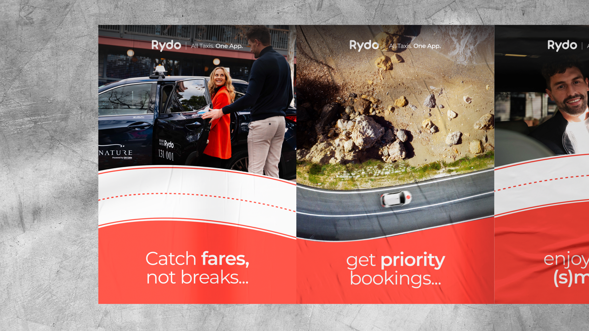
Detailed analysis of every major competitor: Uber, DiDi, 13cabs, GoCatch, Bolt. The research surfaced verticals Rydo wasn’t yet tapping into but had every reason to: wheelchair accessible taxis and maxi cabs. These were not fringe additions. They were strategic entry points into underserved demand with real search volume and genuine alignment with Rydo’s regulated-transport DNA.

03
Content & Authority Building

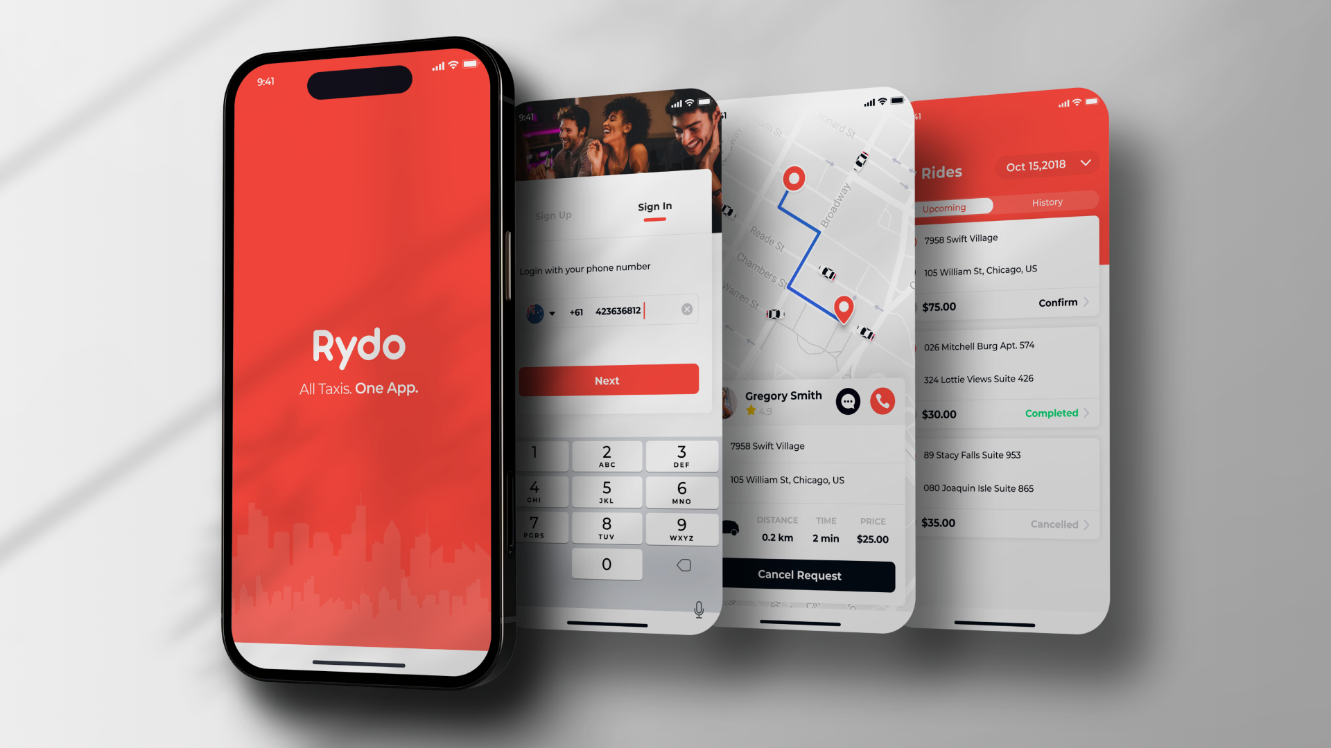
The expanded service offering needed supporting content, landing pages, and GMB presence. AIIMS built out the organic infrastructure to capture passengers at every stage of intent: from discovery (what ride options exist?) to decision (which app should I download?) to conversion (book now). The strategy was not broad. It was surgical.

04
Paid Search Amplification

SEM specialist Melissah Kocoski layered paid campaigns over the organic strategy, targeting high-intent search terms across Google in Sydney, Melbourne, and Brisbane. Organic and paid working in concert: visible in the results, visible in the ads, and unmissable in the maps.

Rydo production shoot
Production & Social

Stopping the scroll means showing up fully.

Rydo didn’t walk into production knowing exactly what they wanted. That freedom was the brief. AIIMS Production Director Ben Canning and the multimedia team reframed the entire narrative: Rydo is not just a taxi company. It’s a premium transport experience.

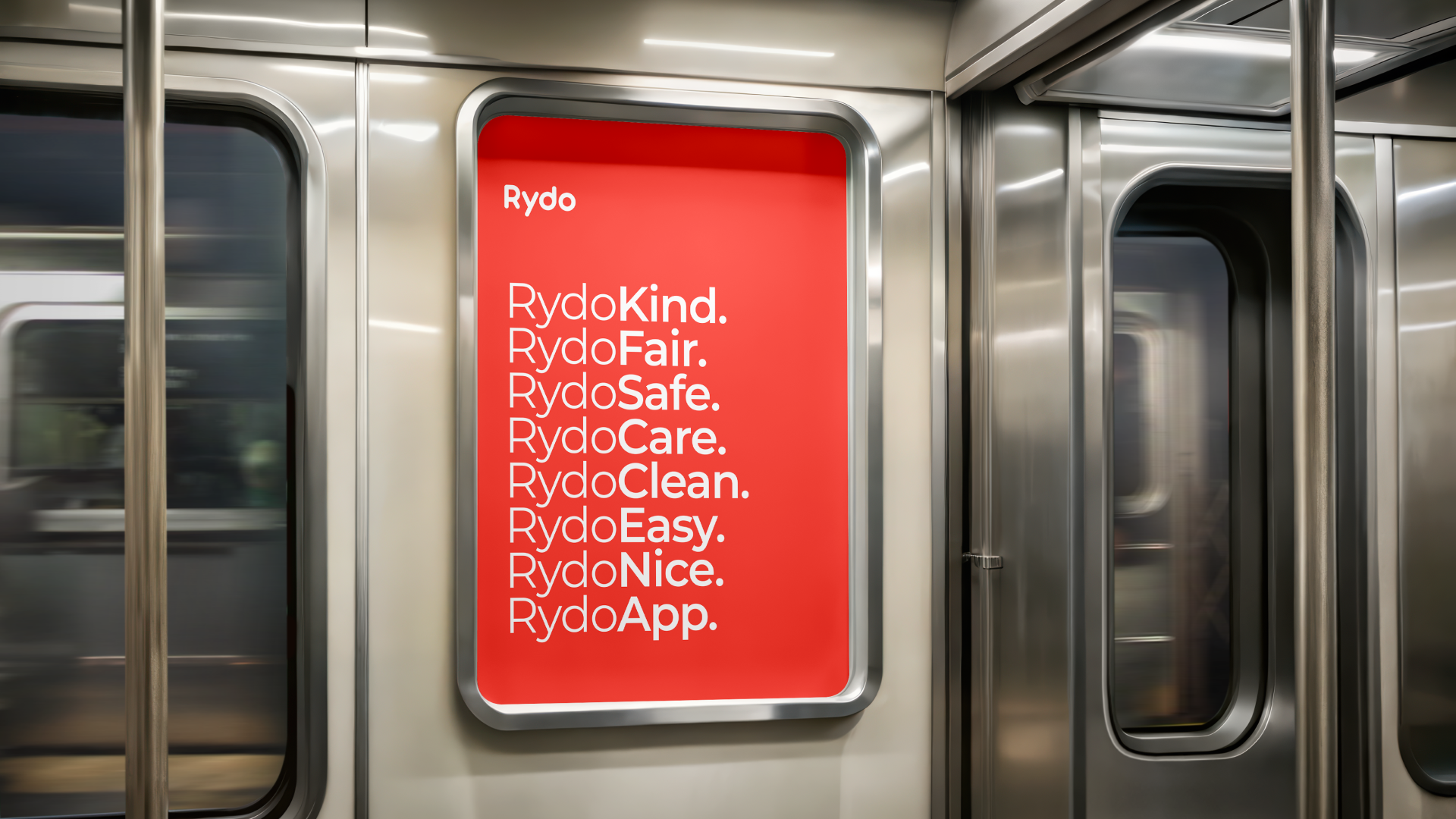
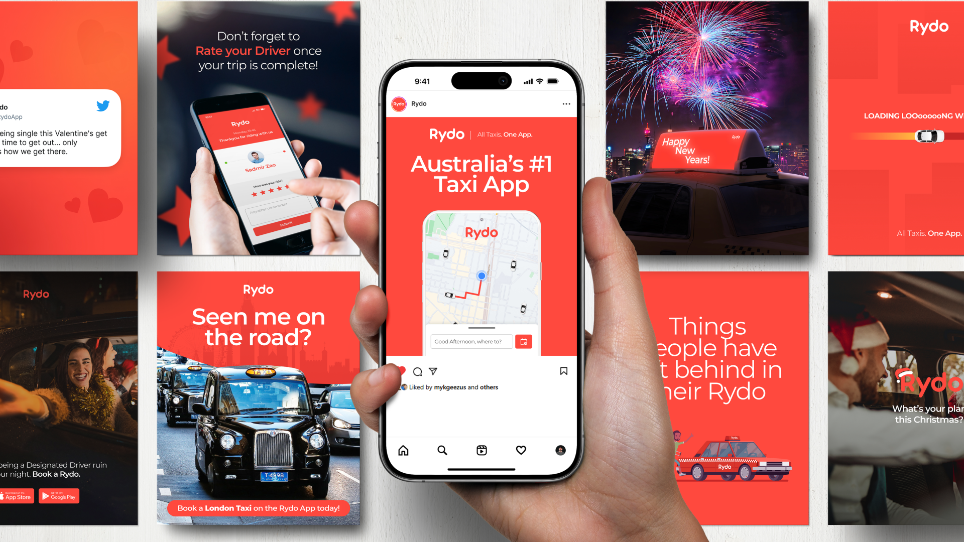
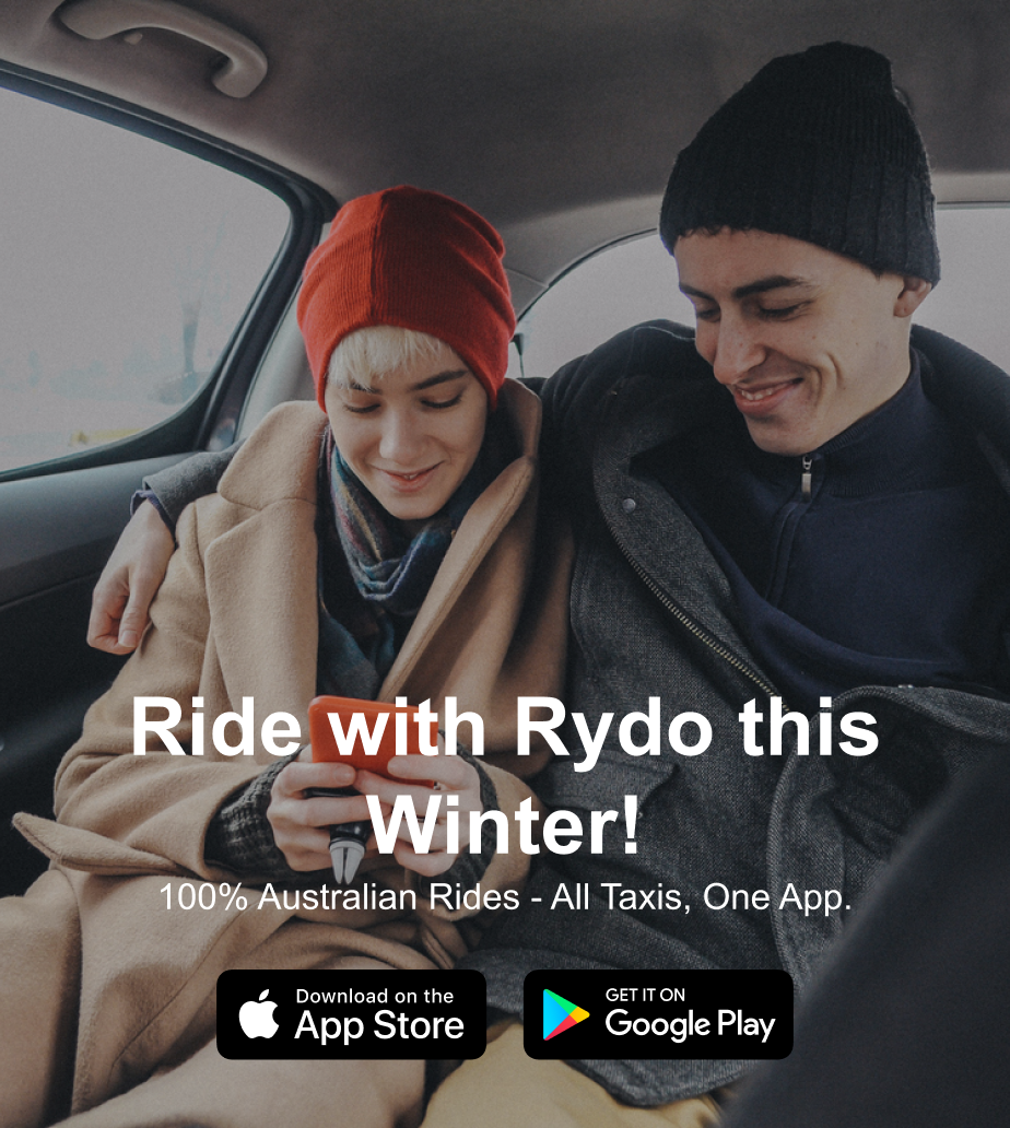
Every shot highlighted the tangible differences: the air con, the bottled water, the phone charger, the cash payment option. The things that make Rydo the ride you’d actually choose if you knew all your options. Paired with UGC content from AIIMS’s creator network, the social strategy reached Meta audiences across Facebook and Instagram and extended into TikTok for Gen Z penetration.

Organic Facebook Paid Instagram TikTok UGC Landing Pages
What We Delivered

The full HALO. Nothing left out.

01
Branding
02
Web Design & Development
03
SEO
04
SEM
05
Social Media
06
Graphic Design
07
Production
08
Google My Business
09
UGC & Content Creation
The Partnership

A client who showed up.

The best work in this industry comes from the intersection of agency capability and client trust. Rydo brought both. Their team was communicative, fast with approvals, and genuinely willing to explore new directions when the data called for it. When the production team called, Rydo’s people showed up. When Jonathon from the SEO team recommended expanding into wheelchair accessible taxis and maxi cabs, the Rydo team didn’t hesitate. That kind of openness is what separates a campaign that looks good from one that actually performs. Creative freedom paired with mutual accountability. That’s the AIIMS model. Rydo is exactly the type of challenger brand it was built for.
Rydo team partnership

“We were making it obvious: Rydo, the only true choice for ride services in Australia.”

AIIMS Group  /  Creative Direction

The team behind the work.

Client
  • Leila DiabMarketing Manager, Rydo
Client Experience
  • Janty AyoubFounder
Design
  • Abby El-AdibUX Creative
  • Michael GahonaUX Creative
  • Caitlin WilliamsUX Creative
Development
  • Suman SatasiyaDeveloper
Production
  • Ben CanningMultimedia Specialist Manager
  • Jaaziel InocencioMultimedia Specialist
  • Yogilan IskandarMultimedia Specialist
Social Media
  • Jasmine JaafarSocial Media Specialist
  • Victoria KhamuSocial Media Specialist
SEO & GMB
  • Jonathan MacabentaSEO Specialist
  • Deanna GashamGMB Specialist
SEM
  • Melissah KocoskiSEM Specialist
AIIMS Group