AIIMS GROUP × CLARENCE HOUSE · FEATURED DIGITAL EXPERIENCE
Clarence House
Sydney · Established 1955
AIIMS
Designed by AIIMS Group
The website should feel like the invitation.
Not the brochure.
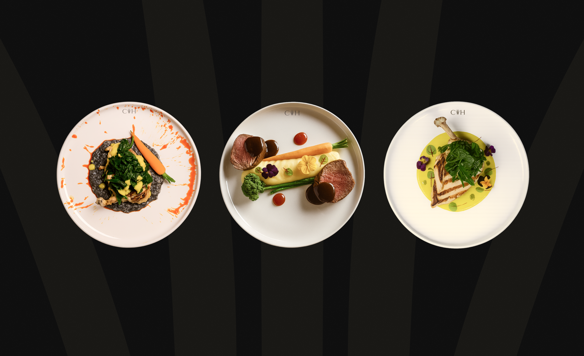
Clarence House × AIIMS Group · Sydney / Dubai
Where a website becomes the invitation.
A complete digital repositioning for a Sydney reception institution. The redesign moves Clarence House from catalogue-style browsing to editorial confidence — trust before price, atmosphere before feature lists, and one unmistakable next step on every screen.
Scroll to enter
AUNG
Design leadership / Dubai
Aung Pyae Sone Oo.
Senior Product, UI/UX & Visual Designer
AIIMS Group — Dubai, UAE
View Aung’s LinkedIn Profile ↗
AIIMS Group — Dubai, UAE
The project begins with a positioning decision, not a layout decision. Clarence House has hosted receptions since 1955 across two Sydney venues and across generations of cultural communities.
The previous experience tried to show everything at once. But a couple choosing where to hold one of the most significant evenings of their lives is not shopping a catalogue. They are looking for evidence of taste.
The new direction is editorial, minimal and timeless. Restraint reads as confidence — and confidence is what a premium venue is actually selling.
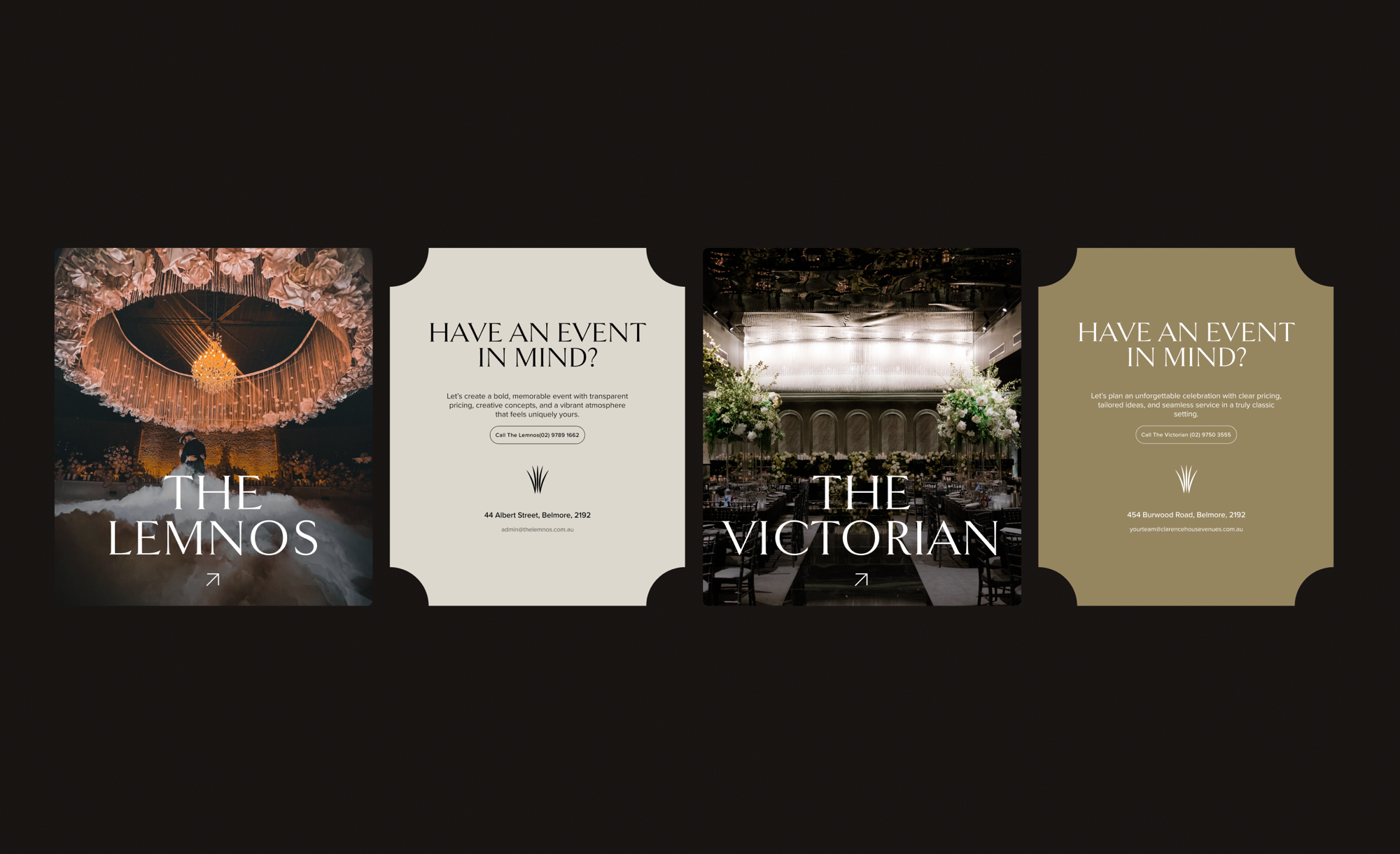
01 · Venue experience / desktop
The interface is allowed to breathe.
01 / Positioning first
A venue with history did not need more noise. It needed more confidence.
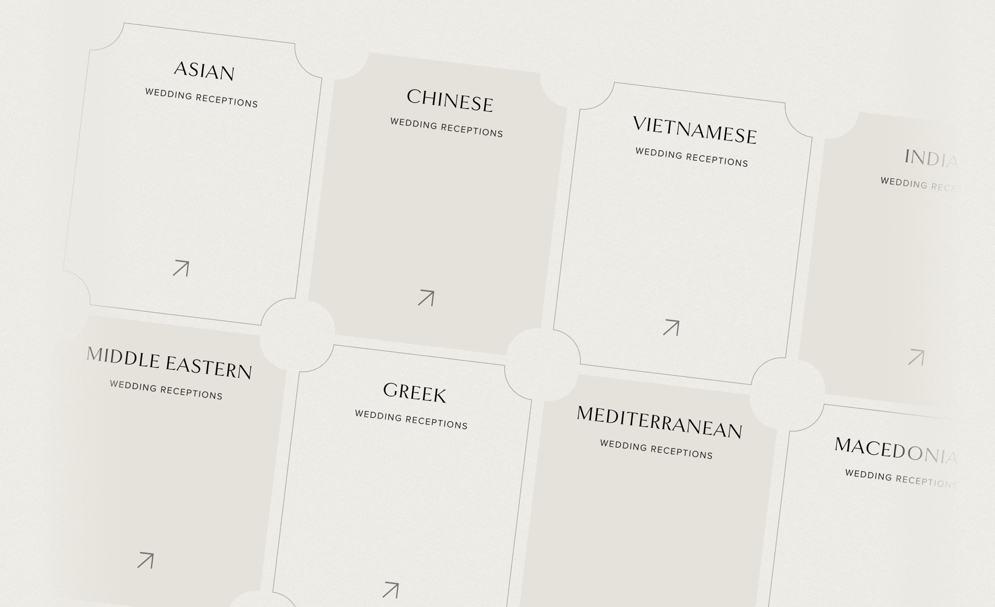
Clarence House serves Asian, Middle Eastern, Mediterranean, Greek, Macedonian, Islander and wider Sydney communities. Cultural breadth is one of the venue’s strongest differentiators.
Instead of giving every event type equal visual volume, the redesign creates hierarchy through pacing. Dark sections create atmosphere. Light sections create clarity. Photography carries the emotion.
02 / The shape system
The site’s geometry comes from wedding stationery.
Arches, notched corners and scalloped edges are not decoration. They borrow from formal invitations: the arched frame, the die-cut card and the notch where a ribbon or belly band would pass.
The arch marks a destination. The notched card marks an invitation to act. One family of shapes, two consistent meanings.
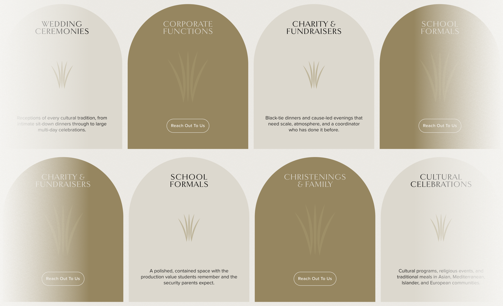
Wedding
Ceremonies
W
Emotion first. A destination, not a catalogue tile.
Corporate
Functions
W
Commercial relevance without visual favouritism.
Christenings
& Family
W
The same visual confidence across every event type.
Cultural
Celebrations
W
Breadth without ranking one community above another.
03 / Type + colour
Hierarchy, not decoration.
A high-contrast display serif carries the personality. The sans-serif system handles body copy and UI quietly, allowing the editorial voice to remain special.
The palette is deliberately narrow: near-black, warm stone, soft off-white and a single brass accent. Dark is for atmosphere. Stone is for reading and deciding.
Near Black
#110D0B
Warm Stone
#E5E2DB
Soft Paper
#F4F1EA
Brass
#968660
Taste
before
noise.
before
noise.
The visitor moves between feeling and thinking without being told to. The contrast is structural, not decorative.
04 / Vertical narrative · Horizontal sequence
Some content should be read. Some content should unfold.
05 / Hospitality as sequence
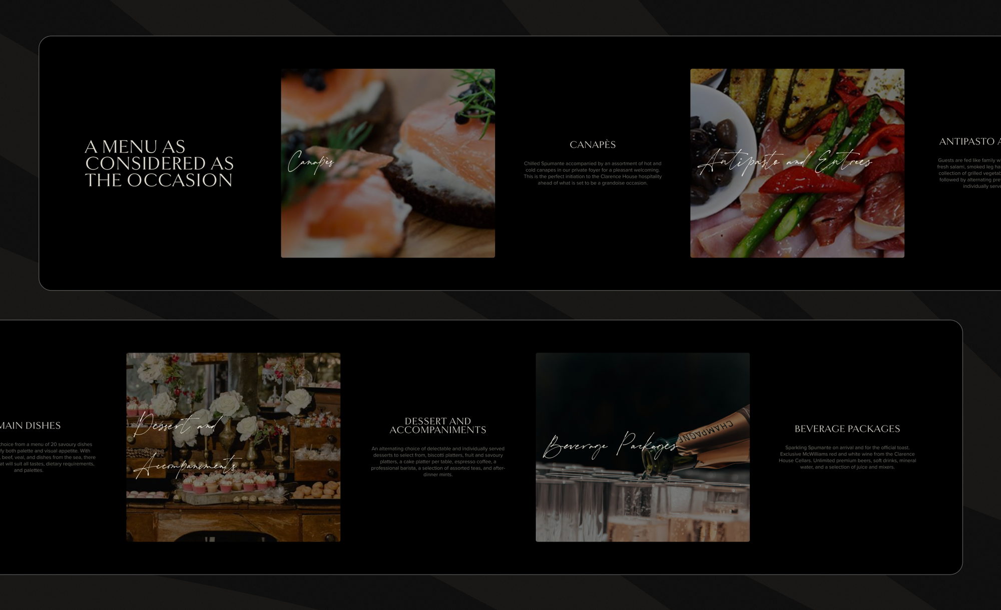
A menu should read like an evening unfolding.
Horizontal movement is used when the content is naturally a sequence or a peer set. The menu can move from arrival drinks to the final pour without turning the page into a six-storey stack.
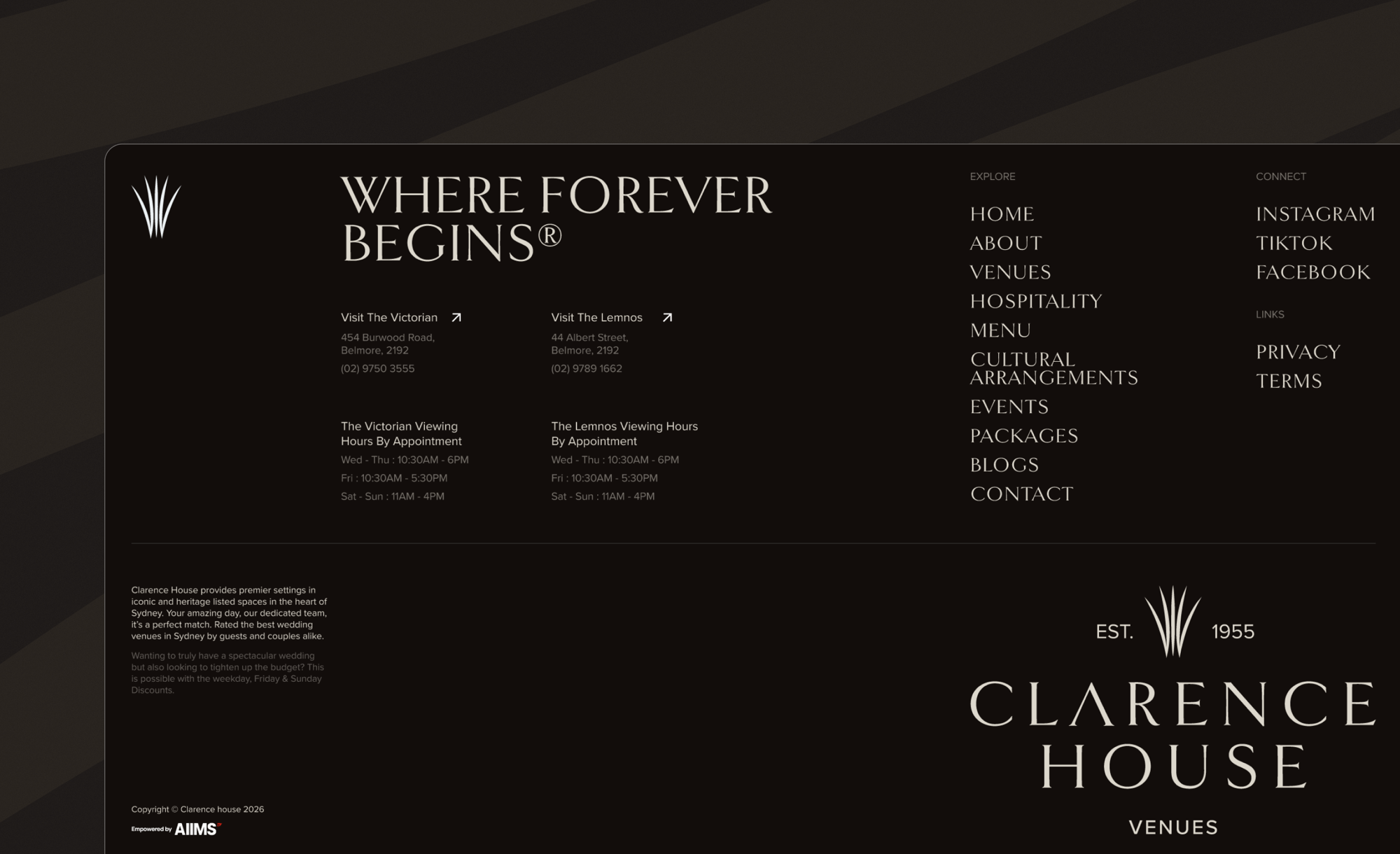
Hospitality / Visual appetite
Photography carries the emotion.
“Direction becomes part of the information architecture rather than a novelty interaction.”
Design Rule / AIIMS Group
06 / Mobile is the primary case
Designed for the phone held between two people at night.
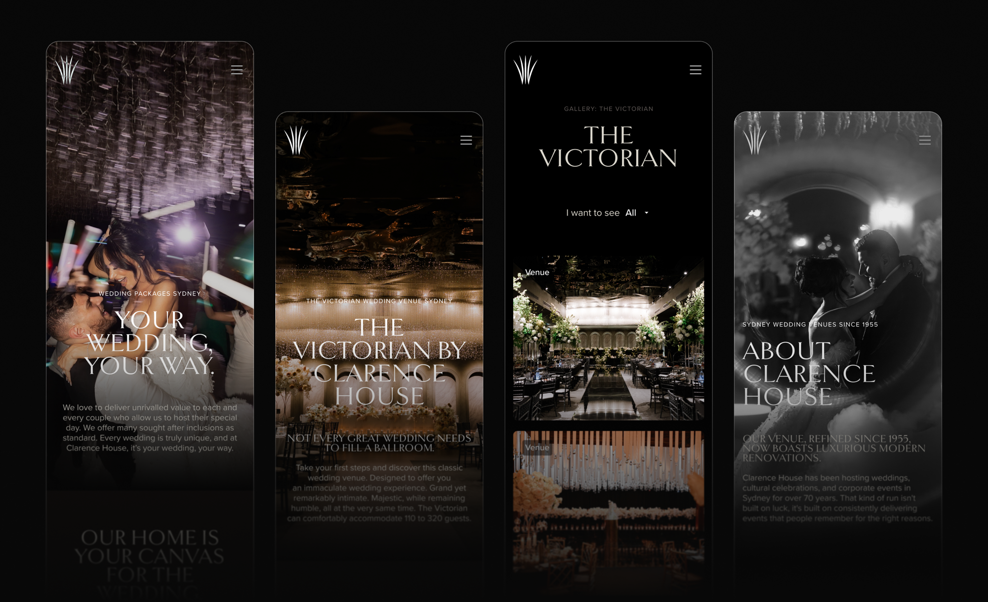
Most venue enquiries begin on a phone — often after hours, often with a partner looking over a shoulder.
The mobile experience keeps photography and display typography at their intended scale instead of shrinking desktop. Cards become thumb-native. The CTA remains close.
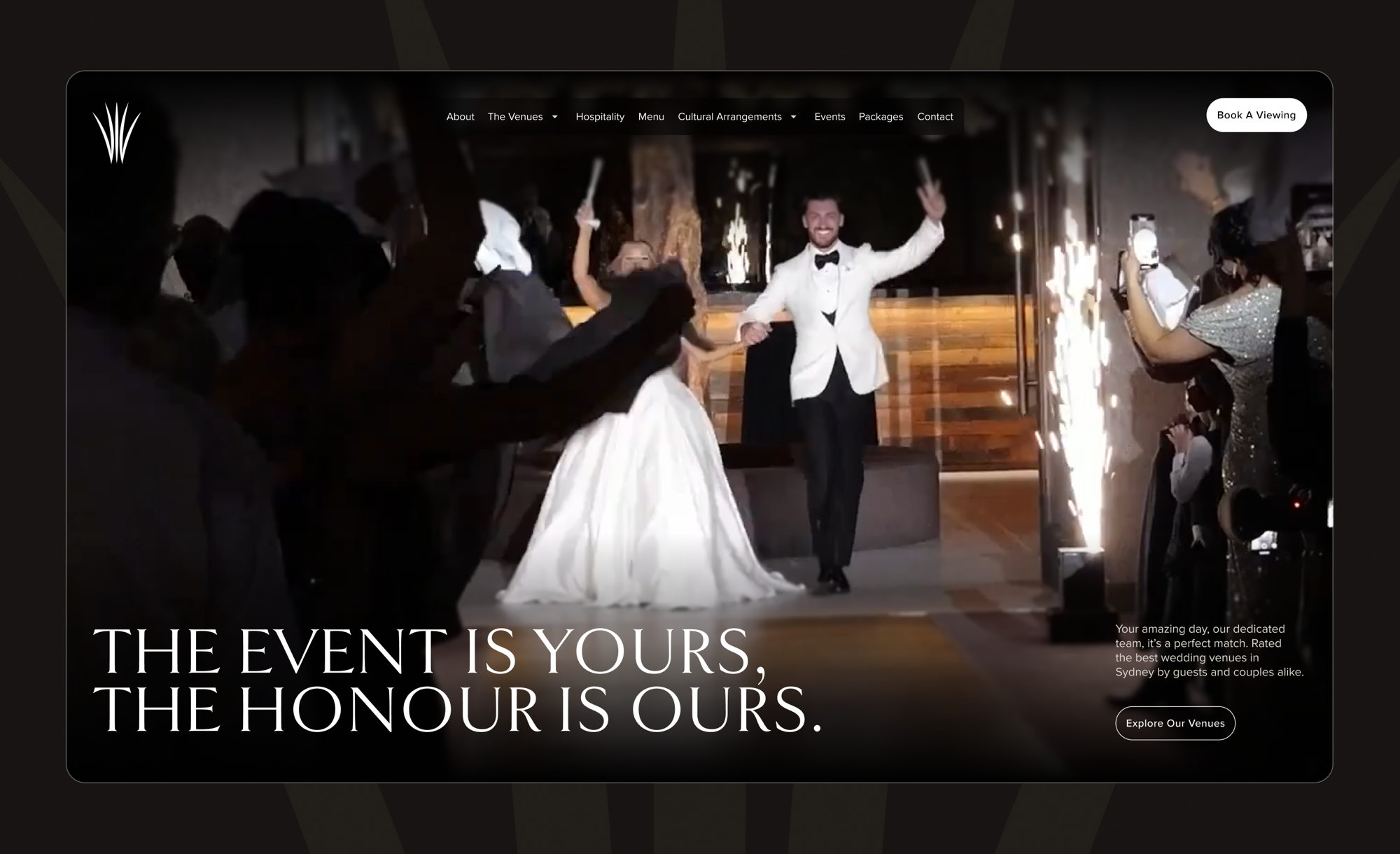
Full-bleed
Photography stays cinematic instead of becoming a thumbnail.
Thumb-native
Navigation and interactions are designed for real phone use.
Conversion close
Book a viewing and enquiry actions remain within easy reach.
07 / Component architecture
A design system, not a collection of pretty pages.
Cards, spacing, colour variables, hierarchy and interaction rules are reusable components. A new cultural arrangement, package or event type can inherit the language automatically.
The system holds its taste without a designer standing over it — which is what makes a timeless design actually stay timeless.
01
Trust before price
The interface earns confidence before asking visitors to compare packages.
02
Atmosphere before features
Photography and pacing establish the emotional register before the detail work.
03
One clear next step
Book a viewing becomes the consistent commercial principle across devices.
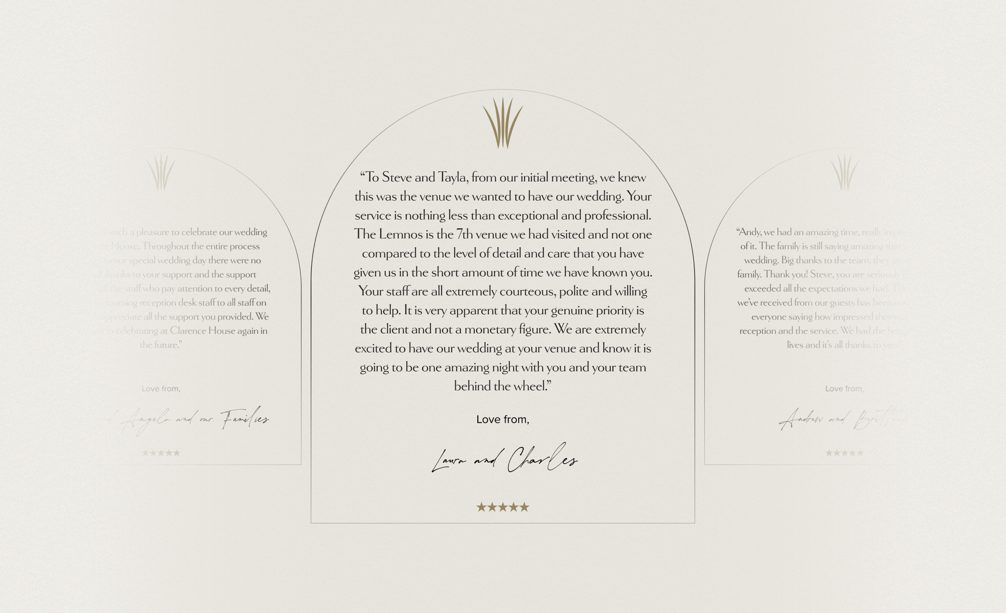
Complete system
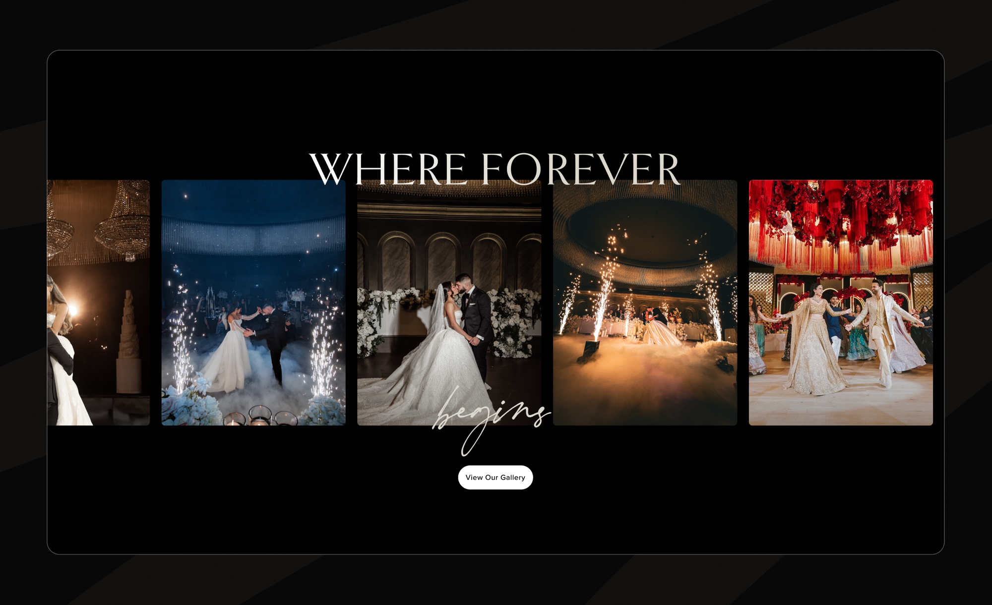
Where Forever Begins®
The redesign is trying to change one thing
Show them.
Don’t tell them.
The old site asked visitors to work out what Clarence House was. The new experience shows them — in the visual language they already associate with the most important invitation they will ever send.