Internal Case Study · Brand Formation · Dubai
HN
Prepared by · Account Lead
Hiba Nadeem
City of Future Builders Logo & Brand Formation
مدينة صناع المستقبلA strategic account of how AIIMS Dubai built a brand identity from the ground up — through six concept rounds, continuous client realignment, and a fundamental repositioning of what this brand needed to say.
This document is not a design report. It is a record of how a brand came to life through strategic leadership, creative resilience, and genuine collaboration across roles. It is written for internal leadership and future client conversations as a demonstration of what real brand partnership looks like in practice.
مدينة صناع المستقبل — City of Future Builders. On the surface, it reads like an educational initiative. In reality, it is something far more nuanced: an experiential destination for children in the UAE, built around the belief that young people learn best when they explore, create with their hands, and connect with culture and nature directly. The founder, Amal Bin Khatim, came to AIIMS with a vision that was vivid in her mind but had never been articulated visually. There was no brand. No logo. No identity. Only a deeply held philosophy and a physical space being built to bring it to life. The brief was simple on paper and complex in practice: create a brand identity worthy of that philosophy. For any organisation entering the UAE market — particularly one working with children, families, and educators — brand identity is not a cosmetic exercise. It is the first and most lasting impression. It communicates trust before a word is spoken. It signals whether a space belongs to the community or sits apart from it. This project was led jointly by two distinct but complementary capabilities. Hiba Nadeem owned strategy, client direction, and communication — holding the vision together across every round of feedback and every moment of uncertainty. Abby El-Adib led art direction, translating strategic intent into visual exploration and guiding the design team through each iteration. The outcome was not the result of one role. It was the result of both working in sync.
Most brand projects begin with a brief. This one began with a feeling. The client knew what the space should feel like. She knew the values it should embody. She had references and colours and words she used to describe it. What she could not yet do was translate those instincts into the language of visual identity. That translation was the core challenge, and it fell to AIIMS to bridge that gap. The initial direction provided a starting point: bilingual Arabic and English identity, blue, green and yellow tones, serif or handwritten typography, cultural depth, a sense of youth and future-orientation. It was directional but not definitive.
Each disapproval was not a rejection of the work. It was the client discovering, through the act of seeing options, what she actually wanted.
Additional complexity came from the stakeholder group. Multiple family members and collaborators were CC'd on every communication.
Dina from Studio DDS, a space concept developer working closely with the client, had her own informed perspective on what the brand should communicate. Any design direction had to hold up under the scrutiny of a diverse and invested group. There was also a fundamental positioning problem that needed to be surfaced before the design work could land. The brand was being developed for what felt like an educational institution. The reality was something closer to a cultural museum, a creative play space, a hands-on discovery environment. Until that distinction was made explicit, every concept was being judged against the wrong benchmark. Surfacing that truth required both strategic listening and creative sensitivity.
The most important decision made on this project was structural: strategy and creative direction were treated as two separate but equally critical functions, each with a clear owner and a shared responsibility to the outcome.
Hiba Nadeem owned the strategy layer. She managed the client relationship, captured and analysed every piece of feedback, translated emotional responses into precise creative briefs, and ensured the work stayed anchored to the positioning problem being solved. When the client said a concept felt "too corporate" or "warmer," Hiba did not pass those words directly to the design team. She decoded them, extracted the underlying need, and converted them into actionable direction.
Abby El-Adib owned the art direction layer. She received that strategic direction and translated it into visual exploration, guiding the design team through each round with a clear creative brief. She made decisions about composition, colour balance, typographic approach, and brand application — ensuring the work produced by the team was coherent, consistent, and aligned with the brief she had been given.
The Division of Responsibility
Strategy feeds creative. Creative informs strategy.
The two roles did not operate in silos. Hiba's debrief after each client conversation directly shaped Abby's brief for the next round. Abby's visual output generated new information about what was possible, which in turn informed how Hiba positioned options to the client. This feedback loop — between strategy and design — is what allowed the project to keep moving forward through multiple rounds of disapproval without losing momentum or direction.
Layer 1 · Hiba Nadeem
Strategic Direction and Client Communication
Every client touchpoint was managed with deliberate intention. Feedback sessions were structured to extract maximum insight. Communications were drafted to manage expectations while keeping the creative process moving. And when the brief needed to evolve — as it did significantly after the first round — Hiba led that repositioning with clarity and without disrupting the client's confidence in the process.
Layer 2 · Abby El-Adib
Art Direction and Creative Leadership
Abby's role was to hold the visual standard across every round. She briefed and directed the designers — Lukas Kaung, Michael Gahona, and Aung Pyae Sone Oo — ensuring each concept served the strategic brief rather than pursuing creativity for its own sake. When the work needed to expand beyond the original direction, it was Abby who pushed the creative range while keeping the team grounded in what the brand actually needed to communicate.
The logo design process moved through
six distinct concept directions across multiple formal rounds. Each direction was commissioned with a specific strategic intent, briefed by Hiba and executed under Abby's art direction. Each taught the team something the brief alone could not have revealed.
Round 1 · Feb 2026
Establishing the Territory
The first round produced two foundational concept directions, both grounded in the brand questionnaire. Typography used:
Neulis Sans, selected for clarity and contemporary character.
Option 1 — Community and Human Potential: Abstract human figures forming a unified symbol. Upward movement communicating growth, encouragement, and aspiration. Vibrant and energetic colour palette.
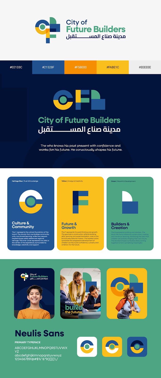
Option 2 — Culture, Future and Builders: Geometric forms subtly encoding the initials C, F, and B. Architectural and structured. Each element carried deliberate meaning: C = Culture and Community; F = Future and Growth; B = Builders and Creation.
Round 1 · Option 1 — Community & Human Potential
Round 1 · Option 2 — Culture, Future & Builders
Option 1: Colour palette appreciated Option 1: Felt corporate and institutional Option 2: More creative and preferred Option 2: Typography felt generic Reference requested: OliOli brand
Round 2 · March 2026
Responding to Feedback — Version 2
Abby El-Adib revised the Option 2 direction with adjusted colour palettes, revised applications across brand touchpoints, and updated mockup imagery. The core architectural concept was maintained while colour balance and visual harmony were refined.
Client Response: Positive about direction but not ready to commit. Requested bolder, more unexpected options that went beyond the original brief. Client's instruction:
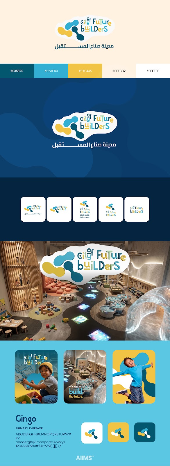
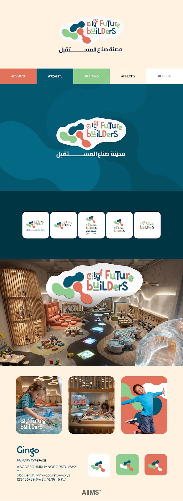
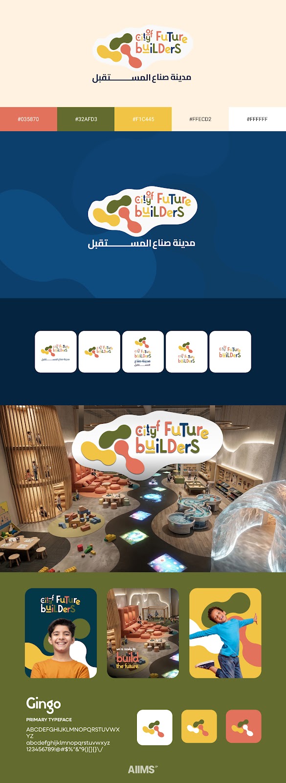
"go crazy."Round 2 · V2 Colour Variant A — Blue Palette
Round 2 · V2 Colour Variant B — Earthy/Olive Palette
Round 2 · V2 Colour Variant C — Teal/Terracotta Palette
Rounds 3, 4 & 5 · March–April 2026
Expanding the Creative Range
Three additional designers contributed to this phase under Abby's art direction. The internal brief — written by Hiba from client feedback, translated into creative direction by Abby — was explicit: build something new from the same strategic foundation. Do not iterate on what has been done. Go further.
Options 3 and 4 were developed by
Michael Gahona, exploring custom letterform treatments and symbol-led abstractions.
Option 5 was developed by
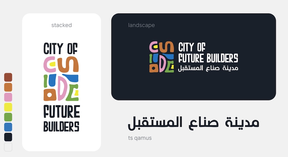
Aung Pyae Sone Oo, introducing a new visual direction grounded in the brand's core pillars. Abby reviewed, refined, and approved each direction before it reached the client.
Round 3 · Option 3 — Michael Gahona · Geometric Wordmark
Round 4 · Option 4 — Michael Gahona · Stacked Shape System
Round 5 · Option 5 — Aung Pyae Sone Oo · Full Brand System
Iteration on this project was not a sign of failure. It was the method. Each time the client declined a direction, Hiba ran a structured debrief. What specifically did not resonate? Was the issue the concept, the colour, the typography, or the application? Was the feedback about the logo in isolation or about what it communicated about the brand? These questions produced answers that were far more useful than the initial brief had been. Those answers were then passed to Abby, who translated them into revised creative briefs for the design team. Abby's role at this stage was not simply to pass on the notes. It was to interpret them visually — to understand what a client's emotional response to a logo meant in terms of design decisions, and to brief the next round accordingly.
The feedback loop between strategy and design is where this project found its direction. Neither role could have done it without the other.
Over time, this loop produced a progressively clearer picture of the brand. The client's language became more precise. The team's responses became more targeted. What started as broad exploration narrowed, through iteration, into something specific, intentional, and genuinely resonant. This is not a comfortable process. It requires both the strategic lead and the creative lead to remain confident in the process even when the output has not yet landed. Hiba held that confidence on the client-facing side. Abby held it on the creative side. Together they kept the project moving through every round of rejection.
The turning point came from a conversation, not a design. During the review call following the first round of concepts, the client clarified something that reframed the entire project.
City of Future Builders was not a school. It was not an educational institution in any conventional sense. It was a play museum. An experiential space. A place where children would come to explore culture, engage with nature, and create with their hands in an environment that felt nothing like a classroom.
Every concept that had been developed up to that point had been benchmarked — consciously or not — against the visual language of education. That is not the visual language of wonder.
Hiba captured this insight and restructured the brief. Abby received it and restructured the creative direction. The moment both the strategic layer and the creative layer were operating from the same repositioned understanding of the brand, the work changed fundamentally. The designers were no longer being briefed to create an educational logo. They were being briefed to create an identity for a place of wonder. That distinction produced different concepts, different colour instincts, different typographic choices. It changed what the team was trying to make.
The Repositioning That Changed Everything
Not a school. A play museum.
City of Future Builders is a place where children explore culture, engage with nature, and create with their hands. The brand identity needed to communicate wonder, discovery, and experiential learning. Once Hiba defined that strategically and Abby translated it creatively, the design process stopped cycling and started converging.
Away from: institutional / school Toward: play museum / experiential Toward: culture, crafts, nature Toward: warm, earthy, organic
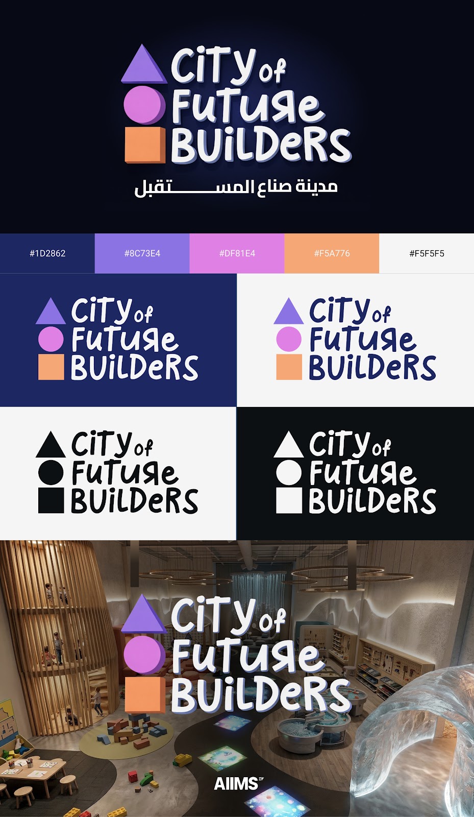
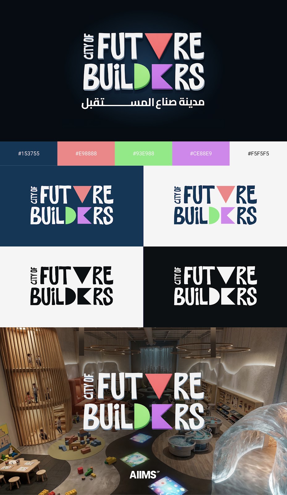
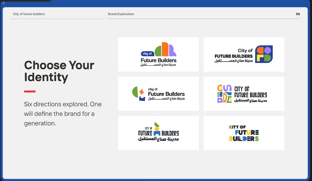
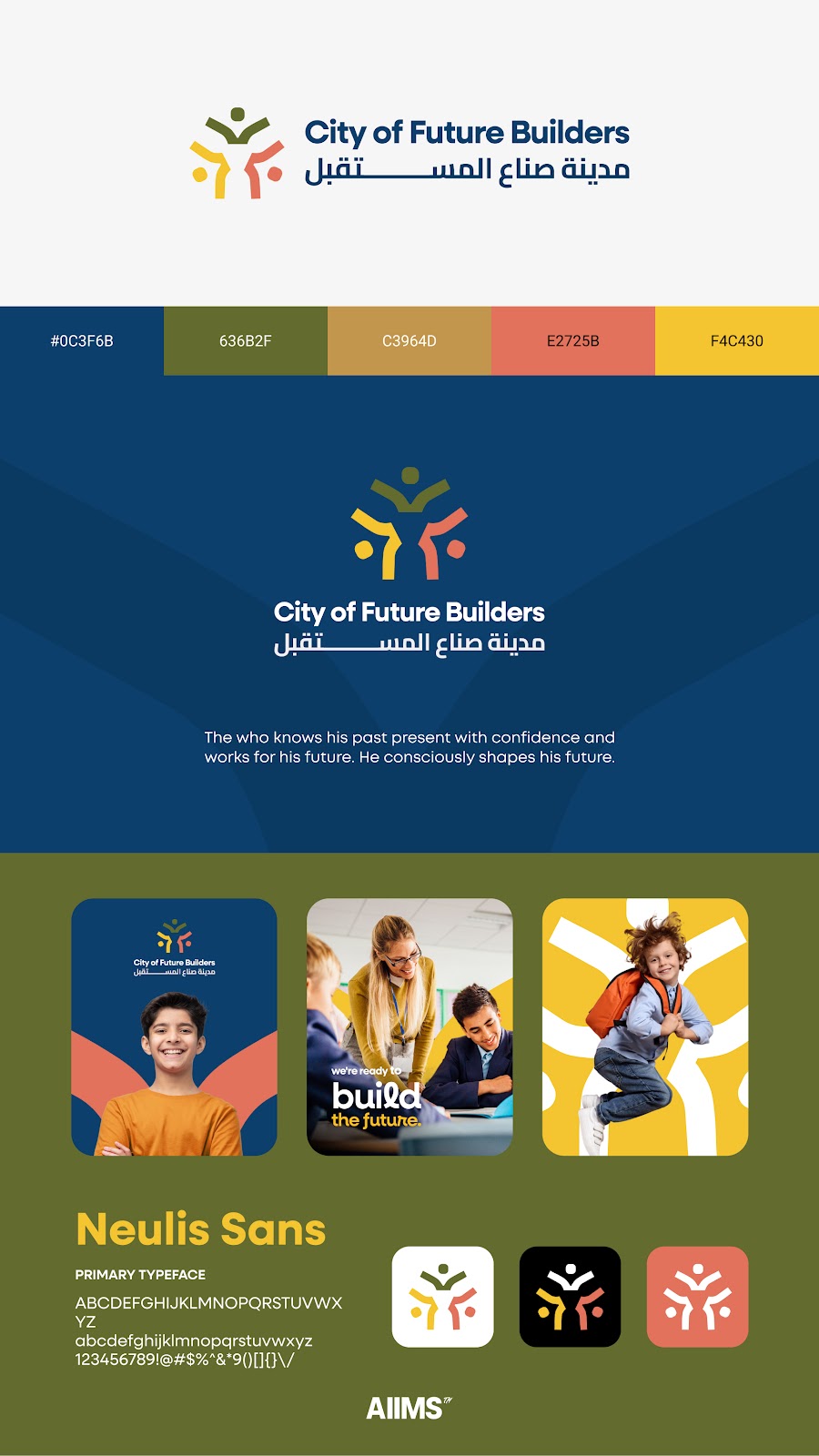
The final direction selected by the client emerged from the sixth round of concepts. It was chosen not because it was the most polished option, but because it was the most honest expression of what City of Future Builders is — and because the team had done the work, across multiple rounds, to understand exactly what that meant. The identity carries the structural intelligence of the CFB concept developed in the early rounds, now expressed through a more distinctive typographic treatment and a colour palette drawn deliberately from the natural landscape of the UAE: warm, earthy, grounded, alive. The Arabic wordmark was given equal visual weight to the English, reflecting the bilingual, culturally rooted nature of the initiative. These were not styling decisions. They were the result of accumulated strategic and creative thinking across months of iteration.
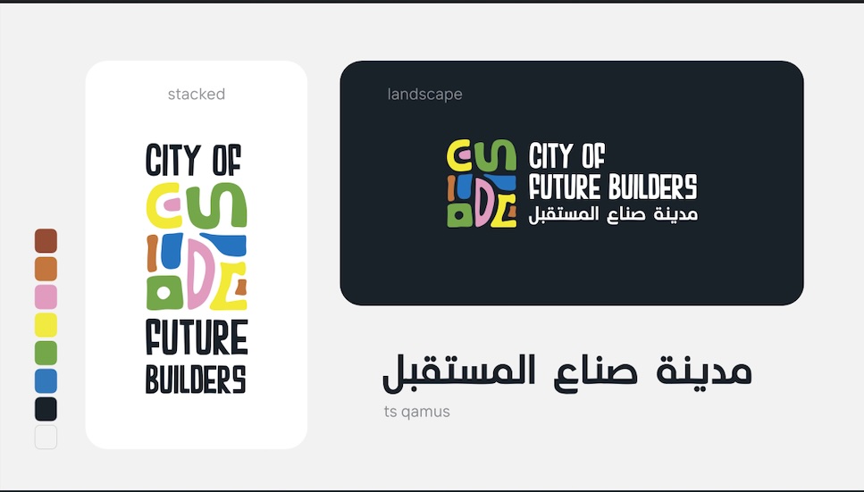
8 April 2026 · Client Presentation — "Choose Your Identity" · All 6 Directions
FINAL APPROVED Final Logo · TS Qamus Arabic Typeface · Multicolour CFB Mark · Client Approved
The final refinements — a revised treatment of the letter E, new Arabic font options, and a colour calibration based on UAE-nature references provided by the client — were executed by the design team under Abby's direction, with precision and speed. Hiba managed the client communication through each micro-decision, keeping the process moving without losing the relationship. The result is a brand identity that does not look like a school. It does not look like a government programme. It looks like a destination. It feels like an invitation. It communicates that this is a place where children are taken seriously as creative thinkers, that culture is celebrated rather than merely taught, and that the future is something being actively built by the people inside the space. That outcome belongs equally to the strategy that shaped it and the creative direction that gave it form.
01
Cross-functional collaboration is the competitive advantage.
The outcome of this project was not the result of one person's talent or one role's effort. It was the result of strategy and creative direction working as a single, coordinated system. When those two functions are misaligned, brand projects stall. When they are in sync, they compound each other's effectiveness with every round.02
Disapproval is information, not failure.
Every rejection in this process added precision to the brief. The team that treats client disapproval as failure produces work that manages expectations. The team that treats it as data produces work that genuinely resonates. This project went through six rounds because the team chose to learn from each one rather than defend what had already been done.03
The brief is rarely complete at the start.
Clients often cannot articulate what they want until they see what they do not want. The role of a strategic partner is to create the conditions for that discovery. The role of an art director is to produce options clear enough to provoke genuine, useful reactions. Both are required.04
Translating emotion into instruction is a skill.
Phrases like "more special," "warmer," "too corporate," and "go crazy" are emotional signals, not design instructions. The gap between those words and a production-ready creative brief is where strategy lives. Closing that gap — consistently, across multiple rounds — is what kept this project moving forward when it could easily have stalled.05
Bringing the client's world into the room changes the work.
Involving Dina from Studio DDS — the person developing the physical concept of the space — was a strategic decision that paid off creatively. The brand identity stopped being designed in isolation from its context. It became grounded in the actual environment it would live in. That groundedness is visible in the final outcome.06
Process is the product.
The client did not just receive a logo. She received a brand built through a process she was part of, that she shaped, and that she can therefore believe in completely. That ownership is worth more than any single design decision made along the way. It is also what makes the brand durable.
AIIMS is not a design agency that also does strategy. It is not a strategy agency that also does design.
It is both, working as one. The City of Future Builders engagement is a clear demonstration of what that means in practice: a strategic lead who understood the client's vision and managed the complexity of getting there, and a creative lead who translated that vision into a visual identity the client could believe in. Neither role was secondary. Both were essential. This is the model. Strategy defines the problem. Art direction shapes the solution. The client relationship holds it together. When all three are functioning — as they did here — the outcome is not just a logo. It is a brand that reflects genuine understanding of who the client is and what they are building. The path from brief to brand is rarely straight. On this project it took six rounds, a fundamental repositioning, and months of disciplined iteration. What made it possible was not talent alone. It was structure, collaboration, and the willingness to keep going when the direction was still unclear. That is what AIIMS brings to every brand engagement. And that is what this project proves.HN
Hiba Nadeem
Account Lead, Client Experience Manager
AE
Abby El-Adib
Designer — Rounds 2, 3 & Brand
LK
Lukas Kaung
Designer — Round 1
MG
Michael Gahona
Designer — Options 3 & 4
AP
Aung Pyae Sone Oo
Designer — Option 5
KA
Kynan Albassit
Design QA / Task Owner
FM
Fahd Mercy
Task Creation / Project Setup
JS
Janty S Mohammed Al Ayoubbi
Director of Strategy